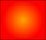
The CSS -moz-radial-gradient Mozilla extension property value was introduced in Gecko 1.9.2 (Firefox 3.6). Gradients are smooth transitions between two or more specified colors. Use of CSS gradients can replace images and reduce download time, create a more flexible layout, and look better while zooming. Firefox supports two kinds of CSS gradients: linear and radial.
Mozilla currently only supports CSS gradients as values of the background-image property, as well as within the shorthand background. You specify a gradient value instead of an image URL.
The -moz-radial-gradient property does not allow repeating gradients. For this functionality, see -moz-repeating-radial-gradient.
Values[]
Values are separated be a comma followed by a space.
| Value | Description |
|---|---|
<position> |
A position, interpreted in the same way as background-position or -moz-transform-origin. If omitted, the default is center.
|
<angle> |
An angle establishing the gradient line, which extends from the starting point at this angle; this is 0deg by default.
|
<shape> |
The gradient's shape. This is one of circle (meaning that the gradient's shape is a circle with constant radius) or ellipse (meaning that the shape is an axis-aligned ellipse). The default value is ellipse.
|
<size> |
The size of the gradient. (See below) |
<stop> |
This value is comprised of a color value, followed by an optional stop position (either a percentage between 0% and 100% or a length value along the gradient axis). Rendering of color-stops in CSS gradients follows the same rules as color-stops in SVG gradients.
|
- Size constants
| Constant | Description |
|---|---|
closest-side |
The gradient's shape meets the side of the box closest to its center (for circles) or meets both the vertical and horizontal sides closest to the center (for ellipses). |
closest-corner |
The gradient's shape is sized so it exactly meets the closest corner of the box from its center. |
farthest-side |
Similar to closest-side, except the shape is sized to meet the side of the box farthest from its center (or vertical and horizontal sides).
|
farthest-corner |
The gradient's shape is sized so it exactly meets the farthest corner of the box from its center. |
contain |
A synonym for closest-side.
|
cover |
A synonym for farthest-corner.
|
CSS examples:
body {
      background-image:-moz-radial-gradient(center 45deg, circle closest-side, orange 0%, red 100%);
}
will produce:
background: -moz-radial-gradient(45px 45px 45deg, circle cover, aqua 0%, rgba(0, 0, 255, 0) 100%, blue 95%);
will produce:
background: -moz-radial-gradient(45px 45px, ellipse farthest-corner, aqua 0%, rgba(0, 0, 255, 0) 100%, blue 95%) no-repeat;
will produce:
background: -moz-radial-gradient(45px 45px, cover, rgb(255, 0, 0) 0%, rgb(0, 0, 255) 100%);
will produce:


